Welcome to my blog for the production of a music video on the track 'Insomnia' by the iconic Faithless

Track Choice: Faithless- Insomnia

Tuesday 28 January 2014

Shoot 6: Plan

Shoot 6: Planning: 31st January
Following extensive audience research of our first rough cut we are aware of the changes that we need to make. To apply all of these changes this requires us to re-shoot certain sections of the music video. we are therefore planning the shoot before hand as we have done previously to ensure the shoot runs smoothly. Are audience feedback was really helpful to gain an opinion from third party views.

What we plan to shoot:


  • Recreate the bedroom scene eg. long shots, mid shots, steady camera work, a range of framing.
  • Digi-pack pictures
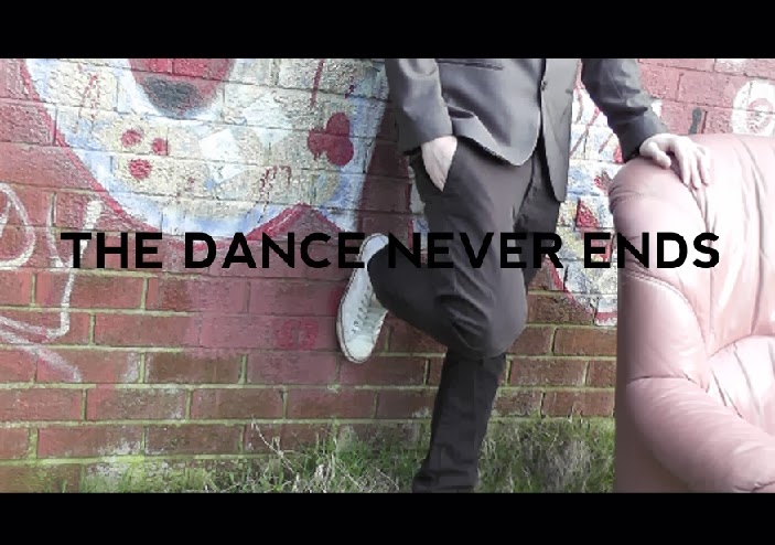
  • Re-shoot at the graffiti wall to get a continuous shot where the character is sat on the chair and the editing is sped up
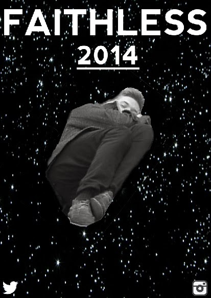
  • Nightmare scene needs changing
  • Recreate the dance section 
  • Shaky camera shots/zoom shots
  • The ending where he potentially confronts his nightmare
Locations:

  • Jakes house
  • Graffiti Wall 
  • Train Crossing
  • Moors
  • Rave Room

Rough Cut 1 Feedback

This is our audience feedback for the first rough cut we created. the feedback we gained was both positive and negative which is what we were after. One thing missing from this is more feedback from our secondary target audience - this is what we will get when we produce further rough cuts.

Monday 20 January 2014

Rough Cut 1

This is our first rough cut we have produced we will be looking to gain feedback on this rough cut then we can improve or change any suggestions if we feel them to be appropriate. We think our rough cut is good however, it can be improved in parts this is what we are hoping to gain back from our audience feedback.

Saturday 18 January 2014

Digipak Draft 1: Feedback


For feedback we showed our digipak design to our target audience and noted down any improvements that could be made from the negatives and positives of our digipak draft.

Inside Feedback:
Inside


From this feedback we found that the inside of our digipak isn't as appealing towards our target audience as we initially thought, this is because they felt that it needed more variety in the images shown in the grid design instead of repeating the same image, also they thought that it could have had more variety in the colours used also. Therefore we'll have to shoot more pictures of our character in the chair so that we can use a variety of images so it's more appealing to our target audience, but also change the colours so that they're more interesting.

Front Cover Feedback:


Front

Then for the front cover they didn't think it worked at all and want improvements to everything. Although there was layering they didn't think it was effective as it was too random, and the text font just looked random and didn't seem to fit any of the conventions of the artist or the genre along with the image used. Therefore we'll have to rethink the layering aspect and change the image to be more effective and relevant to the artist, and with the font more research into the artist is need for it to be effective, this could mean downloading a font that is similar to that used by Faithless.

Rear Cover Feedback:

We had similar feedback for the rear side of our digipak draft as our target audience again didn't think the image had good relevance or significance and the effect that is on this image was unpopular, also they weren't appealed by the yellow font so again the font needs further research and so does the image that will be used here.


Feedback Evidence:


Friday 17 January 2014

CT: Mag Ad Second Drafts


These are our magazine ad drafts.

1.


2.


2.


3.


Half page ad


Digipak Draft 1

This is the first complete draft I created on Adobe Photoshop Elements.

Thursday 16 January 2014

CT: Mag Ad Design

Following my magazine ad research i began to start designing a rough draft for what our magazine advert would look like. following the main conventions i came up with some rough magazine ad ideas. I will then gain feedback and go ahead with the best design.

Mag ad sheet 1
Mag ad sheet 2

Above are my first initial ideas for our  magazine ad and i have began to design the ones i think would fit best with our audience.

I began with the font which i downloaded from a website called TenbyTwenty this offers users the choice to download a number of different fonts. I thought the font Nevis fitted in similarly to the one are artist uses on their website. 


As you can see there is as a similarity between the two which is why i wanted to use this one.

Another font i particularly liked was this dymo font which is similar to the one paramount use for their ident.


This is a rough draft of one of my designs.


Obviously this needs some more exposition on the ad but this is my first rough idea.

For the second draft i decided to try out a different font from the website Dafont.

For the second draft we wanted to include tour dates for our act as this is a main convention for magazine ads. I found a number of past tour dates on their website.

One thing i recognised was that our artist does a number of shows rather close together then has a few weeks before his next gigs eg. 6th, 8th, 9th of march then the next gig would be 30th and the 31st. So this is something we are going to include.

As our artist is recognised internationally his gigs are all over the world. However, we want to narrow ours down to Uk tour dates rather than international. As well as playing gigs and concerts our artist plays at festivals also so this may be something we include.


On our sixth shoot we took the pictures we needed for our magazine ad, this meant that we would be able to create a teaser ad as well, the pictures are below.


This is a first draft of a teaser ad.

I do not like this one at all here is another example of a teaser with a new downloaded font.

This is one of our draft teaser ads with different font colours as the white one didn't link in with the back ground image.

With the black font it stands out a lot more in comparison to the white one.

Tube station themed mag ad.


Tuesday 7 January 2014

Digipak Inside Editing

 For the inside of our digipak there's two sides, one side which is under where the disc is situated and the other opposite to this, and we wanted to make a link between the two sides within the design.


Before Photoshop
After Photoshop

On the side with the disc on top we've planned to use images of our character in the armchair in front of a graffiti wall in different poses, and these images will be in a grid design with 5 images width ways and 5 length ways. Also each row of images will be in a different colour as we think it works well. These are examples for our rough cut only with 4 images but for our final piece we'll be using 5.


Before Photoshop
After Photoshop
Then for the opposite side to the previous we're planning on using a similar idea but instead of the armchair being in front of a graffiti wall this time it's positioned in a field and the range of colours are also different to the ones we used before.